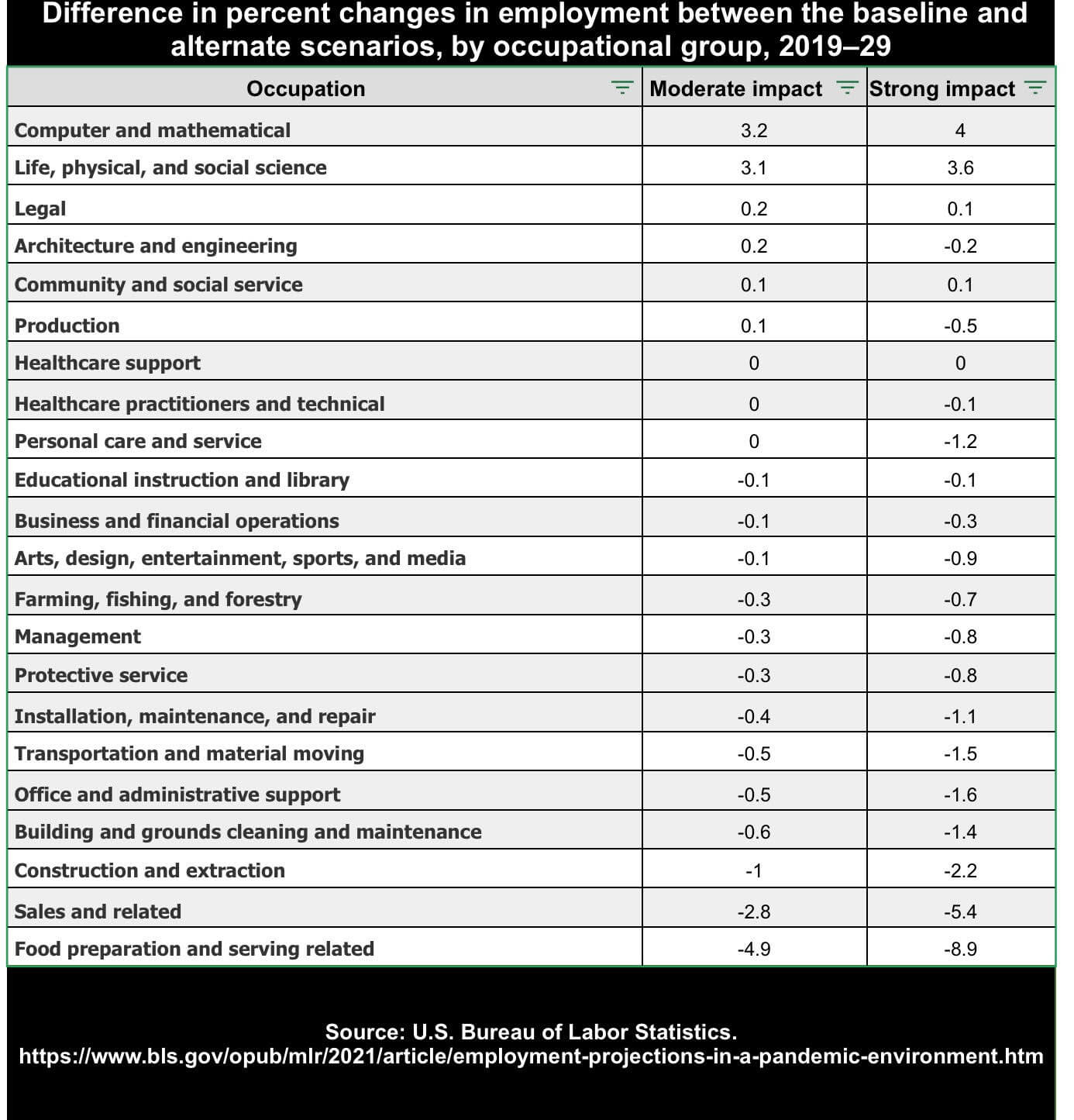
A table illustrating percentage changes in employment between baseline and alternate scenarios for 15 occupational groups from 2019-2029, with an emphasis on learning opportunities. Columns compare moderate vs. strong impact scenarios, listing percentages for each group. Source: U.S. Bureau of Labor Statistics.
by careersingov | Jul 12, 2021

A table illustrating percentage changes in employment between baseline and alternate scenarios for 15 occupational groups from 2019-2029, with an emphasis on learning opportunities. Columns compare moderate vs. strong impact scenarios, listing percentages for each group. Source: U.S. Bureau of Labor Statistics.